If you are looking to visualize the project schedule or timelines, then Gantt charts in the tableau can be very helpful.
It can also be very helpful if you would like to share the dependencies and duration of the project. Also, it can be used to visualize how different members of the team have been utilized in different projects. Gantt charts in the tableau is a directly available chart and can be fetched from show me option.
Requirements for Gantt Charts in Tableau
To create Tableau Gantt chart, we should have the following measure/dimensions-
- 11 Date
- 21 or more dimensions
- 30 or 2 measures
Tableau Gantt Chart Use cases
1. If we have to show how each resource of the team has been allocated to different projects in specific time duration, then Gantt chart in tableau is the solution.
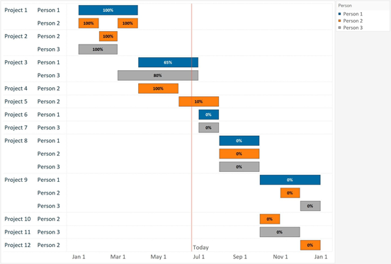
2. If you have to find in a particular month which shipping mode has shipped maximum orders, then also Tableau Gantt chart can be used. For this post also, we are going to use the same example and dataset.
3. Can be used to find the waiting time in hospital
4. Duration of any event and popular one
How to create Gantt charts in Tableau
Please follow the below steps to easily create Gantt charts in tableau-
1
Add Data
Drag order date to the column shelf and make it to continuous

Now as you will be seeing it on year aggregation and so convert that into the date. For that right-click on it and select days

Make sure after that also, it is in continuous view.
Learn Tableau From Scratch in $10
Learn Tableau step by step from scratch. It has an average review of 4.2 on Udemy and many learns have appraised it. Click the link below to get it at the discounted price of just $10.
![]()
![]()
2
Add More Dimensions
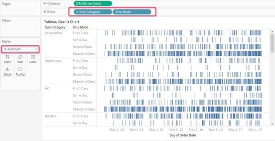
Drag subcategory and ship mode dimensions to the rows shelf and keep the marks as automatic.
3
Add Filter on Date
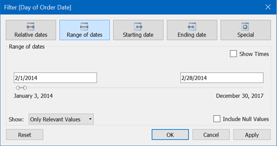
For a better view, let’s filter this chart on the date to view the data for one month. I have selected for the February month of 2014.
4
Create Calculated Field
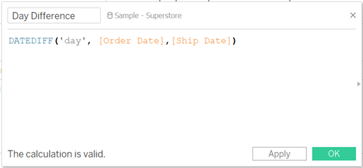
To find the duration of time between the item was ordered and was shipped, we can create one calculated field. And then can use the function DATEDIFF() to find the difference in days.
5
Use Calculated Field
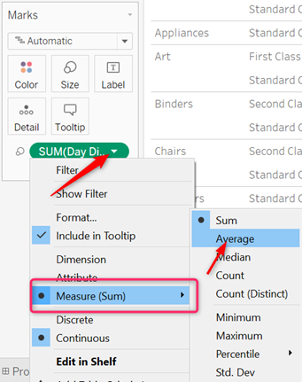
Now let’s drag the calculated field in the size shelf in marks. As we have numerical data in this calculated field (day) and so, Tableau will automatically aggregate it to SUM(). But convert it to Average to make more sense. To convert SUM() to AVERAGE(), just click on it select AVERAGE.
6
Use Ship Mode in Color Shelf of Marks Card
We have already created Tableau Gantt chart but if you want a more clear view, let’s add ship mode dimension in the color shelf in the marks card.
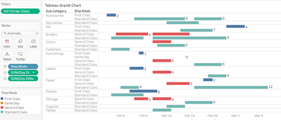
This clearly shows that in Feb 2014, most of the orders were shipped by standard class shipping mode. Even though the first-class shipping method has also become popular around Feb 9, but still standard class is the showstopper.
Wrapping It Up!
These were the easiest way to create Gantt charts in Tableau. We have used that using a sample superstore dataset and you can use a similar technique for your own project needs. Do try and let us know if you find any issue while doing it. For more such tutorials, please check this link.


Leave a Comment